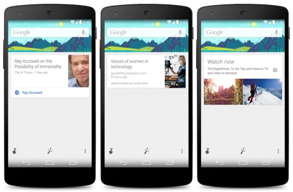
Google Now gets bags of color with Material Design makeover

Google Now is in for a makeover. Image: Google
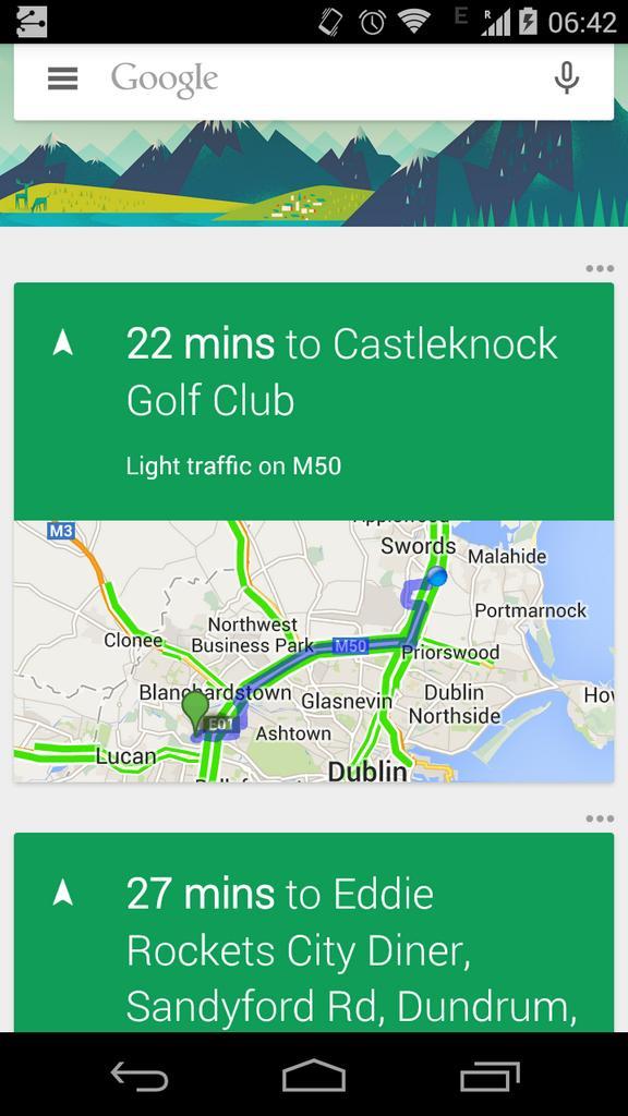
Google Now, by far the best digital assistant on mobile, looks set to get much more colorful with Android L. A screenshot revealing its Material Design makeover was today inadvertently posted on Twitter by a Google employee. It was quickly deleted soon after, but not before the Internet had claimed it.
It seems Google Now won’t just get a new lick of paint with Android L, but various other design changes, too. There’s a new hamburger menu icon next to the Google logo in the search bar — presumably a shortcut to the settings menu — as well as new options buttons for individual cards that now appear above rather than inside them.

Screenshot: Twitter
Phandroid notes that the green highlights in these particular cards may be there for traffic information rather than a makeover, and regular cards may still be predominantly white. But of course, this is all speculation at this point, because we have so little to go on.
We’ll have to wait until Android L gets its public release this fall to see what Google really has in store, then.
- ViaPhandroid


