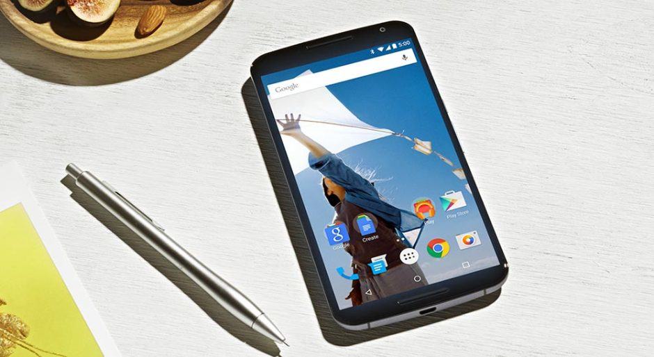
Material Design graces Jelly Bean and KitKat with latest Google Now Launcher

Google Now Launcher gets the Lollipop look. Photo: Google
Desperate to get a taste of Lollipop’s sweet, sweet Material Design makeover? Well now you can — even if you’re still running Jelly Bean or KitKat — thanks to the latest version of the Google Now Launcher. In addition to a whole host of visual improvements, you’ll find welcome changes to Google Now and more.
What’s great about the Google Now Launcher is that it brings a touch or pure Android to almost any smartphone or tablet. Even if you’re running heavily-modified interfaces like Samsung’s TouchWiz or HTC’s Sense, you get almost exactly the same home screen experience — without the stock icons — as you would from Google’s own Nexus hardware.
It also means that when Google rolls out big changes and improvements like the ones in its latest update, you get them at the same time as everyone else.
So, as long as you’re running Android 4.1 Jelly Bean or above, you can now enjoy some of the same Material Design changes that Google has delivered in its latest Lollipop updates. The latest version of the Now Launcher includes new animations, a white Google Search bar and app drawer button, the the new folder design.
It also makes some changes to Google Now; you can now swipe right when you’re inside the Google Now screen to access a new draw that makes it easy to customize the digital assistant, add reminders, and switch between your Google accounts.
If you don’t like the launcher your manufacturer provided you with, I encourage you to give Google Now Launcher a try. The latest version can be found in Google Play now, and it’s completely free.


