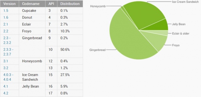
Another Month, Another Depressing Android Distribution Chart
While I should be used to this by now, I just can’t help but feel depressed every time a new Android distribution chart comes out. You see, way too many devices are left running outdated versions of Android and it’s really the average consumer who ends up getting the shaft.
Unlike you and I, the average Joe purchasing an Android device has no idea what Jelly Bean is or that their carrier may be keeping them from receiving it. Nothing is more obvious of this fact than a quick look at this month’s Android distribution numbers.
- Cupcake (almost 4 years): 0.1%
- Donut (just over 3 years): 0.3%
- Eclair (just over 3 years): 2.7%
- Froyo (just over 2 and half years): 10.3%
- Gingerbread (just about 2 years): 50.8%
- Honeycomb (just over 1 and a half years): 1.6%
- Ice Cream Sandwich (almost a year): 27.5%
- Jelly Bean (just under 6 months): 6.7%
Okay, so it’s impressive that there are still some devices out there kickin’ it old school with Cupcake, but there’s no reason why the majority of Android devices should be running an operating system that’s nearly 2 years old.
I’m hoping all those Gingerbread users start taking advantage of those upgrades and at least move onto a device running Ice Cream Sandwich. The jump from Gingerbread to Ice Cream Sandwich was a big one, and according to one Googler, the moment the OS began to walk upright.
Since Google has left users to fend for themselves, I suggest using your New Year’s resolution to help your fellow man/woman better understand the variations of Android and the advantages of one version over the other.
See you next year Mr. Android distribution chart.
- SourceAndroid Developers


