The BlackBerry Z10: A Promising Start, But Don’t Switch Yet [Review]
BlackBerry Hub
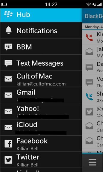
 The BlackBerry Hub is one of BB10’s biggest selling points, and like Active Frames, it’s a unique feature that you won’t find on Android, iOS, or Windows Phone. The Hub is like a unified inbox for every notification you receive, whether it’s a new email, SMS, Facebook message, Twitter mention, BBM, or a missed call — it’s all there.
So with a simple swipe gesture from anywhere, you can see exactly what’s waiting for you. It’s not just a notification center, either — replying to text messages, emails, BBMs and even Facebook messages and friend requests is all done within the Hub itself. In fact, there isn’t actually a dedicated app for email — though there is for text messages and BBM, which is strange.
There are four buttons across the bottom of the Hub — the first shows a slide-out drawer that contains all of your accounts, so that you can look at them individually if you choose to. You can also get to your accounts with a simple swipe to the right, so I’m not sure why BlackBerry felt the need for a button, too. The other three buttons are for search, compose, and an options menu.
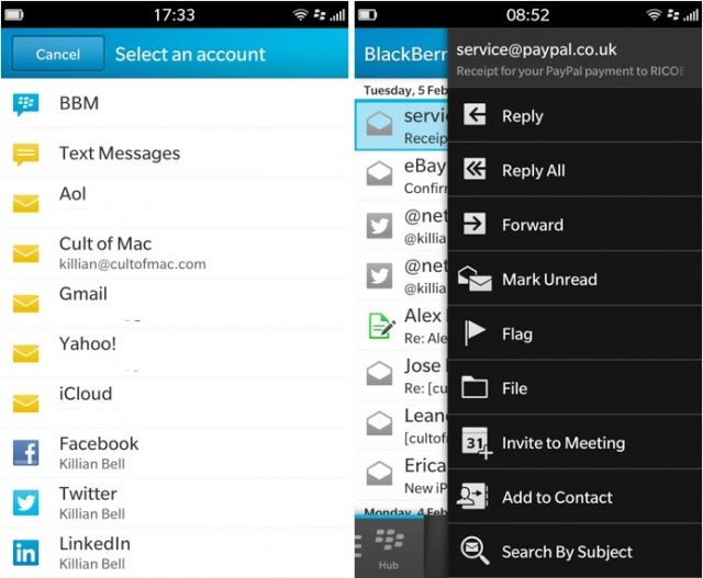
When you hit the compose button, you’ll be able to choose from a list of accounts and services you’d like to send a message from. Here’s where you can choose BBM, or text message, or one of your email accounts.
There’s another options menu that you can access by tapping and holding a message. This presents you with functions like reply, forward, mark unread, flag, file, and more. You can also do all of these things from within the message itself, but there are handy shortcuts available within the Hub if you want them.
You can customize the Hub if you want to, so if you don’t like everything to be grouped together, it doesn’t have to be. You can also look at your accounts individually, so if you want to read your emails without being distracted by Facebook messages, that’s not a problem — just swipe to the right while you’re in the Hub, and you’ll see all the accounts you have set up.
This has its advantages, but there are some disadvantages, too. First, the Hub stays in the same place you left it at all times, and that sometimes makes viewing new notifications a bit of a pain. For example, if you were reading an email before you closed the Hub to do something else, and then a text message came in, you are taken back into the email and you have to navigate back to the Hub to read the message.
I’d like to see BlackBerry change this so that you are always taken back to the Hub’s unified inbox, which would make it easier to view your most recent notifications as quickly as possible. Perhaps even better than that would be a system whereby opening the Hub within a certain amount of time after receiving a new notification automatically take you to that notification. So if you receive an SMS, opening the Hub within five seconds of its arrival would automatically take you to that SMS. Apple’s iOS lock screen has a feature like this that works well; when new notifications come in, you can unlock the device within a certain time period to be taken to the app that wants your attention.
I’ve noticed a strange bug in the Hub — it’s only happened twice, but it’s been hugely frustrating. When I receive emails from a certain person, they just don’t open. I tap on them and they show for a split second, but then I’m taken back to the Hub. I have no idea what it is — it could be something about their signature, or the email content, or even the sender’s name that the Hub doesn’t like — but not even a full restart solves it. I had to read these emails on another device.
Despite its shortcomings, I’ve enjoyed using the Hub. It’s another BB10 feature that shows a lot of promise, and I’m sure it’s only going to get better as BlackBerry irons out the little kinks over time.
Keyboard
 BB10’s keyboard is terrific. BlackBerry is famous for its keyboards, and it’s proven that they don’t have to be physical to be awesome. It sports a nice layout, and typing is accurate and responsive. Up until now, I didn’t think Apple’s iOS keyboard could be beaten, but BlackBerry’s done it. After just a few hours with the Z10, I was already a better typist on this device than I am on other smartphones — and I’m not a bad touchscreen typist.
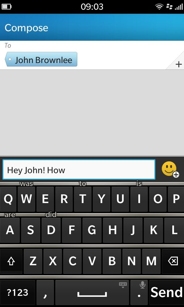
The keyboard offers a really great predictive text feature, which gives you suggestions as you type. But these suggestions don’t appear above the keyboard like on Android — they appear above certain keys, and you can swipe up from those keys to insert the suggested word. The keyboard also learns the more you use it, so these suggestions get better over time.
The feature is a little strange at first, but once you get used to it, it makes typing much faster. I tend not to use it a lot for shorter words, but for longer ones it’s great. It’s also really useful for typing with one hand.
Another great feature about the keyboard is that it will support up to three languages at any time — and it automatically recognizes which language you’re typing in, and changes its suggestions to suit. So you can send an email in English, then begin composing another in Spanish without changing a single setting.


