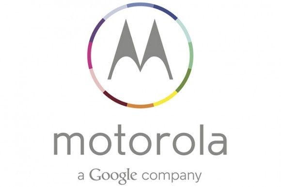
Google’s Rebranding Of Motorola Continues With A Redesigned Company Logo
Motorola Mobility has a much-improved company logo — much better than the old one — which makes it clear that it is now “a Google company.” Since the search giant acquired Motorola back in August 2011, there hasn’t been many visible changes to its branding or its products. So a new logo is a huge step in the right direction.
The original ‘M’ badge still remains, but is presented in a more colorful way — in true Google style. The classic bold and italic “MOTOROLA” which has been used for decades no longer exists. Instead, it has been replaced with an all-lower-case typeface that’s both softer and thinner, giving the logo a cleaner and more modern look.
It looks like Google is finally ready to move forward with Motorola’s handset business and is set to rebrand it, in a big way.
The redesign of the company logo comes at an important time in Motorola’s history, as its first American-made X device is coming later this year and will be the first Moto hardware to be released with a significant input from Google HQ.
- SourceBusiness Insider


