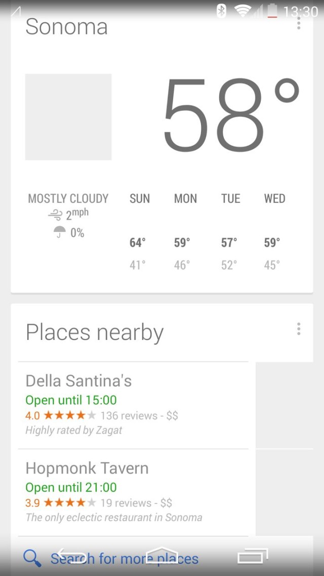
Why Does Google Hide Google Now?
Why does Google call it “Google Now”? Wouldn’t “Google Occasionally” or “Google Never” be more accurate?
Google Now is clearly designed to be used “now,” or all the time, or at any time. The “now” suggests that when something of interest happens, you learn about it “now.”
Trouble is, Google doesn’t present the service in a way that makes it useful as a real-time notification system.
Right now, Google Now is the default interface for nothing. It’s aways out of sight, out of mind.
In order to use Google Now on, say, Android KitKat, you have to not only know the secret handshakes (there are two basic swipe gestures that conjure up Google Now), but also remember to go get it. You have to decide: “Ok, I’m going to go use Google Now now.”
I’m guessing almost nobody does remember. I know I don’t.
Even though it’s pretty much my second favorite Google anything (after Google+), I almost never remember to use Google Now.
I suspect that hardly anyone uses Google Now daily. And probably a majority of Android users never, ever use Google Now.
For most apps, this is perfectly fine. In fact, chaos would reign if every app vied for attention as the default interface on any device.
But Google Now is different. It’s core attribute is contextual interruption. But it’s rendered nearly useless because it doesn’t interrupt.
It’s like mounting a GPS device in the trunk. It’s there, but to get directions you have to pull over, get out and open the trunk.
It’s like a phone that powers off all the way after you’re done using it. When someone calls or texts you, you won’t know about it until you power it up and check for incoming calls and messages.
The utility of Google Now exists only when it’s right there in front of you, surprising you with contextual information. If you have to always remember to go looking for it, the utility goes out the window.
Google Glass gets it right. When you wear Google Glass all the time (and have the right apps installed), you’re occasionally interrupted with incoming messages, news alerts and details about points of interest near you.
Google Now should be Google Glass in app form for every other device.
Where Google Now Should Live
Google Now should be the primary interface for many Google products and even non-Google devices.
For example, why isn’t there a Google Now screensaver for Windows, OS X and Linux?
Why does the Google Search interface exist when it could be the Google Now interface — the same search box, plus Google Now contextual cards?
Why aren’t I looking at Google Now cards each time I turn on my Android phone or Android tablet?
Why don’t Google Now cards work like Facebook Home, where they can appear (if I choose) to pop up on top of other apps and remain there until I swipe them away.
Other Google Now Flaws
I love Google Now not for what it is, but what it could be. My question is: Why doesn’t Google make Google Now what it could be?
For example, why are Android notifications and Google Now two separate things? Sure, Google Now show up in notifications. But that’s backward. Instead, notifications should (optionally) show up as Google Now cards — especially if Google Now is the dominant interface.
Another beef is that Google Now isn’t as configurable as it should be. I’d love to see Google+-like sliders for more or less of certain categories of Google Now stuff. And if I turn everything both on and all the way up, Google Now should be a torrent of cards.
Mostly, though, Google Now needs to figure out how to be in my face the same way Google Glass is on my face.
When a Google Now card pops up, I don’t want it later. And I don’t want it never. I want it now.


