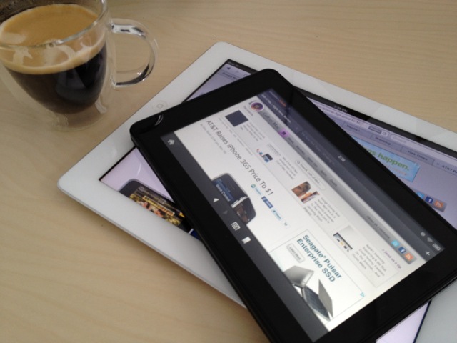
How Does Amazon’s Kindle Fire Compare To The iPad? [Review]
Early reviews of Amazon’s Kindle Fire haven’t been kind, but I like the device. It’s a versatile and enjoyable little media tablet.
It doesn’t pretend to be anything it’s not (a general-purpose tab), and though not as polished as Apple’s products, its a good first try.
The trouble is that everyone is comparing the Kindle Fire to the iPad, and it will always come up short. The Kindle Fire is actually closer to the iPod touch, but it’s not that either. It’s a well-made, well-designed window into Amazon’s media ecosystem, and on that score, it succeeds very well.
The problem most reviewers have with the Fire, it seems, is that it’s no iPad. It won’t run a million apps, take photos, videoconference, or be used to create content. It doesn’t have a camera, GPS, or a 3G cellular connection. It’s 7-inch screen is too small. It doesn’t have a hardware Home button or even volume-control buttons.
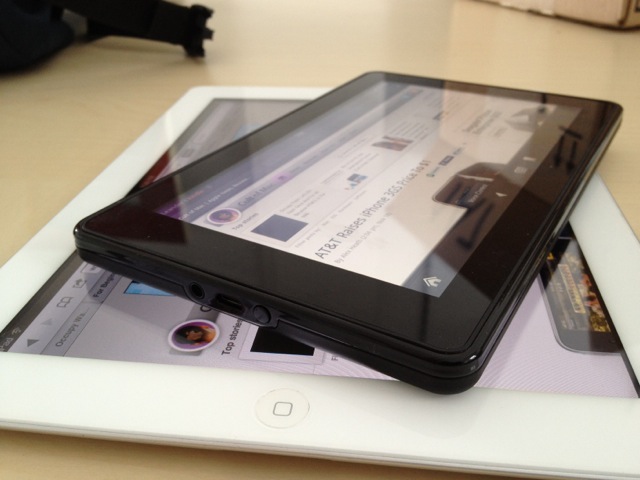
What it is, is a compact black plastic-and-glass slate that’s chunkier and heftier than you’d expect. The soft rubbery back feels nice to the touch and it’s much easier to hold for bedtime reading than an iPad. It can almost be stuffed into a jacket pocket for a trip to the coffee shop (if you have big pockets).
The Good:
It’s $199 — less than half the price of the cheapest iPad.
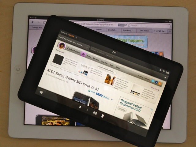
The 7-inch screen is bright and sharp — It has almost the same resolution as the iPad 2 (1024 x 600 – compared to 1024 x 768). Although some have complained the screen is fuzzy, to my eyes it’s sharper than the iPad 2. I loaded up several websites and a book to cross-compare, and text looked much sharper on the Kindle Fire.
Great for reading in bed — And I like that the Kindle app runs on my iPad, iPhone, MacBook Air and iMac, so I can read any eBook I purchase from Amazon anywhere. That’s something Apple needs to do with iBooks.
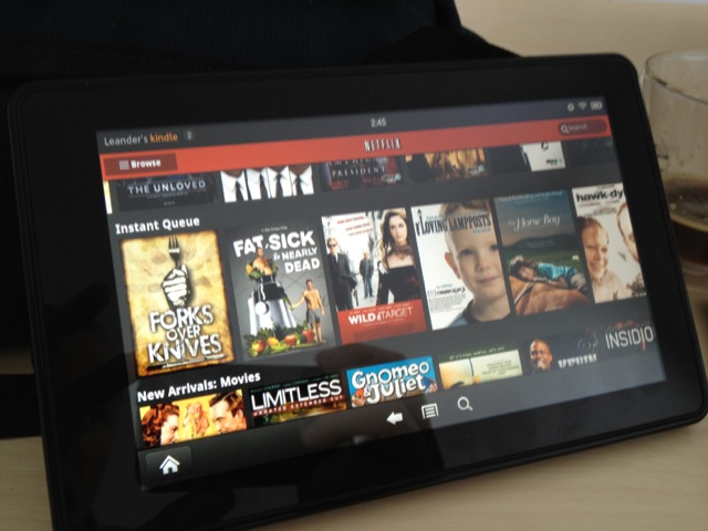
Easy set-up — Setting up Gmail, Facebook and Netflix was a breeze.
Performance — Early reviewers complained that the Fire was sluggish, and the Silk browser horribly slow for surfing the Web. Maybe they got a pre-release version of the Fire software or Amazon quickly fixed performance issues. As soon as I connected my Fire to the internet during setup, it downloaded a software update. I haven’t had any performance issues with the Fire. It’s not as a fast or as a responsive as the iPad 2, and there are occasional hangups, but it’s not painfully slow.
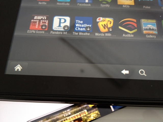
Navigation — Getting around is via Home and Back bottoms — both software buttons. The Back button is inter-modal. It applies to web pages in the browser but also jumping around between apps, like a universal undo. It’s an intuitive and familiar navigation scheme, and I find it dead easy to use.
Preloaded account — The Fire was preloaded with my Amazon account, and all the digital content I’ve ever purchased from Amazon was already linked to the device (but not downloaded). Everything was neatly arranged in the appropriate tab in the Fire’s media browser — books, video and music. This arrangement is actually easier to navigate than the iPad’s content navigation, which is split across several apps.
Amazon Prime — If you have an Amazon Prime account (I do) then the Kindle Fire is pretty cool. Paying $80 for a year’s worth of Amazon Prime is cheaper than paying for Netflix and you get a lot of extra awesomeness other than just streaming Amazon Prime Video. The lending library is great for voracious readers who are cheap like me and doesn’t like buying new stuff all the time.
Cloud integration and streaming — Digital content can either be downloaded onto the device or streamed from the cloud. Some have complained that the Fire’s 8-Gbytes of storage is too skimpy, but if you’re streaming most content, you don’t need it. Because I have a sad life, I’m rarely far from a Wi-Fi connection. The only time I need to load content is before a trip, and 8-Gbytes should be plenty for a couple of movies and some playlists. The process of managing downloads or streaming is dead easy. It actually puts Apple to shame with the hoops you sometimes have to jump through loading and deleting content through iTunes.
Silk browser — There’s been tons of complaints about Amazon’s Silk browser, which has been eviscerated for being slow and buggy. I haven’t encountered any such problems. In my experience, it’s a pretty good browser. It’s not the fastest, but it renders pages well and quickly. It supports all the features expected in a modern browser — tabs, bookmarks, stored passwords, etc. It also supports Flash, which many people will consider a curse, not a blessing (it’s easily turned off though). Amazon says it also preloads pages and promises to get faster as it learns what sites are popular with Fire users. Some have discovered that browsing is quicker with this feature turned off.
You can install unsanctioned apps — Like Apple’s devices, the Fire is only supposed to run apps sanctioned by the parent company. The Amazon app store is anemic, which should change over time, but it’s actually dead easy to install unsanctioned apps. Go to Settings>Device and turn on “Allow Installation of Applications From Unknown Sources.” I was able to install Spotify, the streaming music service, where I have a premium account. I can now stream Spotify to the device even though Spotify isn’t yet available in Amazon’s app store and may never be. (Set up, btw, was dead easy and it works flawlessly.)
Easy to charge — No proprietary dock connectors here. The Fire charges via micro USB, which is becoming the universal standard (mandated in Europe). Around the house, I charge it up using the kids’ cellphones chargers.
The packaging — The Fire comes in a simple cardboard box that’s completely recyclable except for the plastic sleeve than encases the device. Apple’s packaging sometimes irritates me with its preciousness. Jeff Bezos, on the other hand, is refreshingly straightforward and utilitarian.
The Bad:
Responsiveness — The Fire is nowhere near as responsive as the iPad. Where the iPad always recognizes a touch or swipe, the Fire sometimes has to be handled with kid gloves. You have to slowly and deliberately hit a button front and central for the touch to register.
Power button placement — For some inexplicable reason, the power button is on the bottom between the speakers. It’s a strange place to put it, because when you keep hitting it when using the device and putting it to sleep.
Games — This is where the Fire really falls short on the iPod touch, a game-console par excellence. I can’t see kids clamoring for the Kindle Fire over the iPod touch.
Volume control buttons — It really needs hardware volume-control buttons. To change the volume, you have to exit any app you’re using and go into the system settings. It’s way too painful when watching a movie or web video.
Wi-Fi only — Amazon already offers Kindles which have free cell connections, the cost of which is built into the price of eBooks and online magazine subscriptions accessed through the device. It would be much harder for Amazon to offer the Fire with a similar subsidy, but no doubt Amazon is working on 3G models. Stay tuned for version 2.
Verdict:
The Fire is no iPad killer, but it is the first Android version of the iPod Touch. It’s the first device that fulfills similar functions without a cellular contract — and at a lower price.
You don’t create anything on a Kindle, you simply consume. It’s not even really a tablet because it’s so small. It’s just a really great eBook reader, but that’s not a bad thing. For $200, it’s great for people who want to save money and don’t need all the features of an iPad.
[xrr rating=80%]

