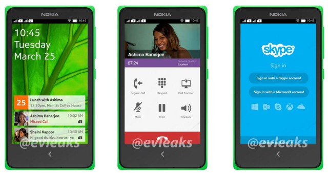
Nokia’s Purported Android UI Is Too Beautiful To Be Buried By Microsoft

We already know that Nokia’s been working on an Android-powered smartphone called Normandy that may never see the light of day thanks to the Finnish firm’s close relationship with Microsoft. And that’s an even more disappointing thought when you see its custom Android user interface in these leaked screenshots.
It looks like nothing we’ve seen before on Android, and I don’t know about you, but I like it.
Based on what we know about Normandy at this point, the handset is designed to be an entry-level device — possibly part of Nokia’s budget Asha lineup — aimed at consumers who don’t want to spend too much on a smartphone. As we can see from the screenshots, the device would run popular apps like Skype, but it may not be a typical Android-powered smartphone.
Nokia’s user interface looks nothing like regular Android, which suggests the company will take a leaf out of Amazon’s book and develop its own platform that simply uses Android as its basis. So Normandy may have its own app store as opposed to Google Play.
That certainly seems like a downside, but the interface itself looks pretty darn impressive. It’s clean and colorful — much like the Windows Phone platform that powers Nokia’s Lumia smartphones — and there’s only one virtual button.
Unfortunately, it seems unlikely Normandy will ever make its way to market.
Nokia has a very close relationship with Microsoft and launching a smartphone that’s powered by a rival operating system could damage that somewhat. Some reports have suggested that Microsoft could buy Nokia’s smartphone business, which would almost certainly quash the small possibility of an Android-powered Nokia smartphone.
- SourceEvleaks


