Why Fenix should be your only Twitter client on Android

I discovered an awesome new Twitter client when I was browsing Google Play earlier this week, and after using it for the past four days, I’m encouraging everyone I know with an Android device to go get it.
It’s called Fenix, and it’s the best third-party Twitter client you’ll find — for many reasons. Not only does it look good, but it’s easy to use, customizable, and feature-packed. Here’s why you should download it today.
It’s beautiful
Like all good Android apps, Fenix does away with the clutter to present you with a clean and clear user interface that looks great. It takes advantage of your smartphone’s large display and ensures that not a single inch of it is wasted.
Fenix ensures not a single inch of your display is wasted.
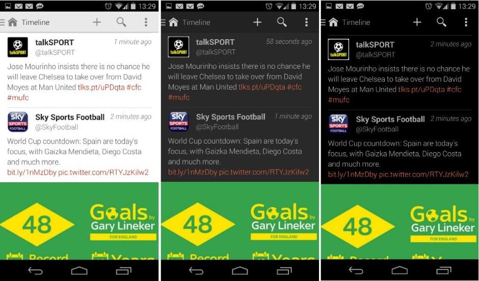
I’ve used both Carbon and Talon on Android, and while they’re both good apps, I wasn’t a fan of how they pushed tweets over to the right side of the screen to make room for profile pictures. Fenix displays profile pictures and usernames above tweets, so that the tweets themselves — as well as in-line picture previews — can span the whole width of the page.
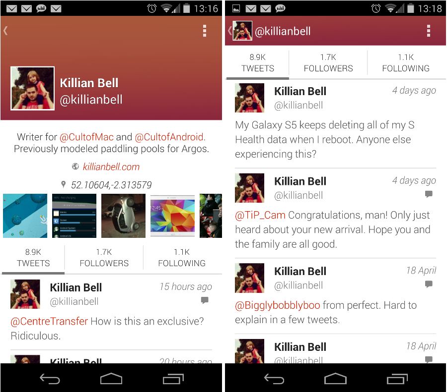
User profiles also look good. You get to see both the avatar and the profile banner above the user’s description, and as you scroll down to their timeline, these things elegantly move up into the navigation so that tweets fill up the full length of your display.

User image galleries are also easy to find — they’re right above the timelines — and you can scroll through them and tap the ones you wish to see in full-screen view.
You can’t yet swipe through galleries in full-screen view yet, and you won’t see the accompanying tweet text alongside images, unfortunately. But Fenix developer Matteo Villa tells me both of these things will be added in a future update.
Inside Fenix’s settings menu, you’ll find both “dark” and “black” themes if you prefer that look — or you have an AMOLED display and want to conserve power — and you also have the ability to change the size and type of font used throughout the app.

It’s simple
Fenix is super simple to use. When you open it up, you’re taken straight to your timeline, and you can refresh it with a simple swipe down. If there are new tweets to see, Fenix tells you how many in the navigation bar across the top of the display, and you can tap it to be taken straight to the top of your timeline.

This is a trick that’s long been used in iOS apps, but you don’t see it around much on Android. And that’s a shame, but it makes jumping to the top of long pages — such as your Twitter timeline — quick and easy. It’s one of the many little things that makes Fenix such a joy to use.
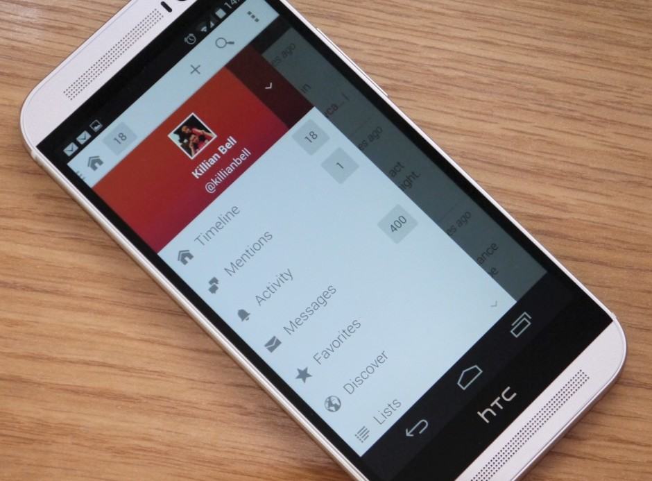
I also like the way it handles navigation. There’s a navigation drawer that slides out from the left side of the screen that provides you with direct access to your timeline, mentions, messages, favorites, and more — or you can simply swipe through these sections from your timeline.
Navigating Fenix is a joy.
Fenix also allows you to hide and rearrange these sections, so if you don’t care about things like messages, favorites, or the “Discover” section, you can remove them altogether.
Creating a new tweet is as simple as tapping the plus arrow that is always present at the top of your screen. In the compose window, you’ll find the option to toggle the location stamp, insert pictures or videos, and select drafts you’ve already created.
It’s feature-packed
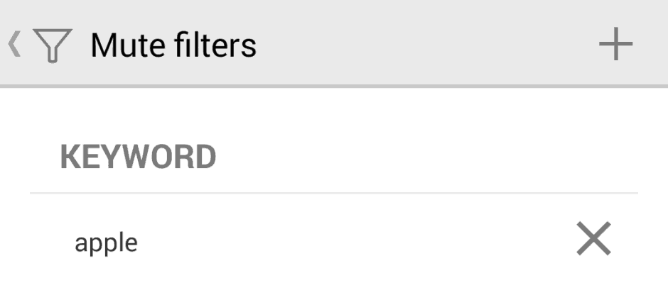
Fenix offers everything you’d expect from a good Twitter client. As well as providing you with all the basics, it offers features like mute filters, which allows you to block specific keywords to prevent them from appearing in your timeline.
 If you have no interest in Apple’s upcoming Worldwide Developer Conference, for instance, you can block keywords like “Apple,” “iOS,” “OS X,” and “WWDC” — and all tweets that include these terms will disappear from your timeline.
Fenix has a nifty “Activity” section that displays your retweets, favorites, mentions, and new followers in real-time. You’ll need to activate it when you set up the app — it’s switched off by default — and you can change the refresh interval in the settings menu.
Fenix also supports multiple accounts and TweetMarker, allows you to save as many drafts as you like, and lets you create and save as many draft tweets as you like. It also offers username and hashtag auto-completion when composing a tweet.

It’s paid
There are no ads.
Fenix costs $2.49. “Why is that a good thing?” you ask. Well, it means there are no ads — and as far as I’m concerned, that’s the way it should be. I don’t want to have to look at advertisements for things I don’t want when I’m on Twitter, and I’d much rather support developers upfront for their hard work.
And you should, too. These are just some of the reasons why Fenix is a terrific Twitter app, and if you look for any of these things in a Twitter client, you’ll love it, too. It’s immensely better than the official Twitter app, and in many ways the best third-party option available.
Instead of getting a coffee on the way to work this morning, then, have one at home before you leave and spend $2.49 on Fenix. You won’t regret it, and you’ll be supporting a great app that’s only going to get greater.
- Google Play StoreFenix


