TouchWiz a touch too slow in Galaxy S5 vs. Moto E speed test

If you had to guess what would win a simple smartphone speed test between the Galaxy S5 and the new Motorola Moto E, you’d choose the Galaxy S5 every time. I know I would. But quite incredibly, we’d both be wrong.
The Galaxy S5’s bloated TouchWiz interface means that simple actions take much longer than they should. Opening apps, scrolling long lists, and navigating menus is actually smoother and snappier on the $129 Moto E. Don’t believe me? Check out the speed test video below.
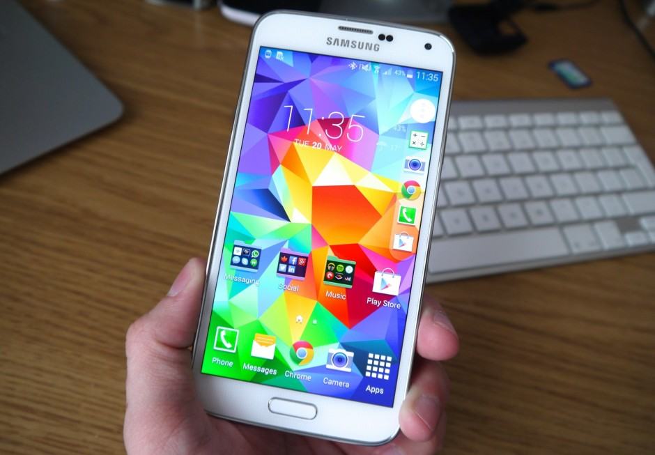
TouchWiz is enough to make an incredible phone a terrible phone, and in many ways, that’s exactly what it’s doing to the Galaxy S5. Samsung’s latest flagship has all the ingredients you’d look for in a high-end device — including the latest processor, an excellent camera, and a stunning display — but the experience is undeniably marred by its software.
Not only does TouchWiz take up more than 4GB of the Galaxy S5’s internal storage space, but it changes every inch of the Android platform that it’s built upon. Every menu and icon is skinned, every animation is customized, and there are enough (pointless) Samsung features packed in to send any Android newbie running in the opposite direction.
I know this from experience. I have a Galaxy S5, and there many things I love about it — particularly its camera. But I choose to use an HTC One M8 instead because, amongst other things, it delivers a noticeably smoother experience. I use my phone a lot, so this is important to me.
Of course, the Galaxy S5’s quad-core Snapdragon 801 processor means it is more powerful than the Moto E — by a long way. When it comes to benchmarks and playing the latest games, there’s no competition. But as the video proves, at simple, everyday things like navigating the interface and launching apps, the Moto E is snappier.
How do you feel about that, Galaxy S5 owners?
- SourceYouTube


