Google’s Snapseed app got much worse in version 2.0

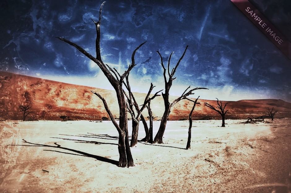
This effect is no longer possible on Snapseed on Android or iOS. Photo: Google
Available for both iOS and Android, Google’s Snapseed has long been one of my favorite on-the-go photo retouching apps. After a year without updates, then, I was excited to see Google update Snapseed to version 2.0, with several new features, including the ability to copy edits from one image to another, five new filters, adjustable lens blur, and brush tools.
Unfortunately, the Snapseed 2.0 update wasn’t all for the better. In fact, it stripped the app of one of its best features: the grunge filter.
Snapseed’s grunge filter was a cool way to make photos look more arty and time-ravaged. When applied, it made an image look darker, and almost like it had been artfully water damaged.
I loved it, and apparently, I wasn’t alone, because there’s an army of angry Snapseed users on Google’s own product forums, complaining about Grunge being missing, as pointed out by App Advice.
One user wrote: “Grunge is a MAJOR component of my work flow. My art is highly influenced by the effects it produces.” Another said: ““Don’t make we artists wIt for the fix. Bring back grunge right away.”
Nor is the only issue the fact that Grunge is missing. Here’s one user complaining about the entire new UI:
I was heartbroken when I opened Snapseed yesterday and saw the new app. Snapseed has been my go-to iOS photo editing app for years! I am so disappointed and frustrated that I have to now learn a totally new user interface. Yes, there seems to be some cool new features (brushes, spot repair, etc.) but why totally change the UI?
Google on their part is keeping silent about whether or not we can expect them to bring back Grunge in future versions of the iOS or Android app, although Google does say that feedback will inform future design changes. So if you miss Grunge, make a stink about it!
Source: App Advice


