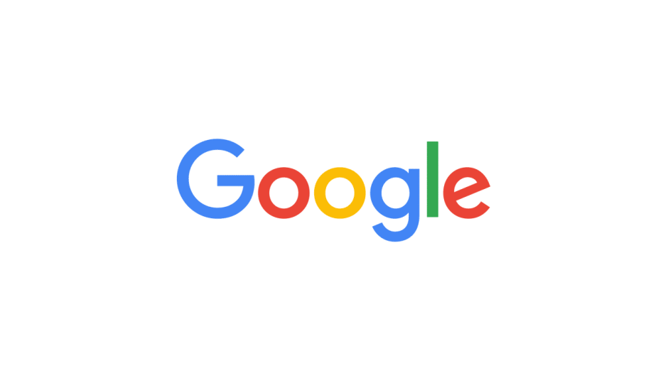
Google forgot to search for ‘sophisticated logo design’

The new Google logo is simpler than ever. Photo: Google
Google revealed it’s getting a new logo today that ditches its rough edges for a more simplified (some would say childish) design. The change comes just a month after the company announced it was being restructured with Sundar Pichai taking the CEO reigns of the company now owned by Alphabet.
The new logo was introduced this morning on a blog post from Google’s VP of product management, Tamar Yehoshua, and UX director Bobby Nath, who justified their kiddie logo, saying it’s supposed to reflect the many platforms users interact with Google on throughout the day.
“Today we’re introducing a new logo and identity family that reflects this reality and shows you when the Google magic is working for you, even on the tiniest screens,” the company announced. “As you’ll see, we’ve taken the Google logo and branding, which were originally built for a single desktop browser page, and updated them for a world of seamless computing across an endless number of devices and different kinds of inputs (such as tap, type and talk).”
Instead of using the same serif woodmark font its employed since 1999, Google has switched to a sans-serif typeface that’s designers created called Product Sans.
The new logo is expected to roll out to products soon. Along with the new design, the logo features new elements like a colorful Google mic to interact with Google when you’re talking. The company is also ditched the little ‘g’ icon and replaced it with a four-color G to match the new logo.


