New Android app design guidelines ripped from iOS playbook
Your Android apps are going to get an iOS-style makeover soon, thanks to new design guidelines from Google.
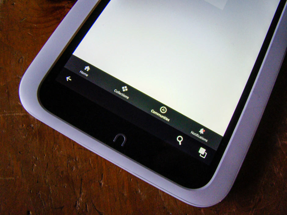
Mostly concerned with the bottom of Android apps, Google is looking to have its developers place a bar across the bottom of their apps that will let users navigate between different sections of the app, just like iOS currently does.
In essence, Google is borrowing the already ingrained idea (for iOS users) that to move between different areas of an app, you’ll look to the bottom navigation bar to do so. Google wants this bar to disappear when users are scrolling up and down an app’s pages to free up more of the screen, though — a departure from iOS’s always-on design.
Google isn’t leaving out tablets or desktop installs, either.
“Larger displays, like desktop, may achieve a similar effect by using side navigation. For instance, the compact ‘rail’ treatment displays navigational icons by default,” writes Google in its design guide.
Side navigation on iOS can be seen on iPad and the larger Plus versions of the iPhone 6.
Most Android folks are used to the three horizontal lines (or hamburger icon) to indicate finding in-app navigation, but this can slow people down, and is hard to find for Android neophytes. A bottom nav bar will help everyone get around more quickly and efficiently.
Google goes even further, though, saying that a bottom navigation bar should only be used when an app has “three to five top-level destinations,” or when those destinations must be accessed from anywhere in the app. The alternatives are noted as a “persistent navigation drawer” or tabs for one to two different areas.
Google Photos has been updated with a three-button navigation bar, while Google + has had a bottom bar for a while, now. This design style is rare beyond these couple of Google apps, but should become more prevalent as developers add it into their own apps.


