Instagram could boot app colors to make your photos look better
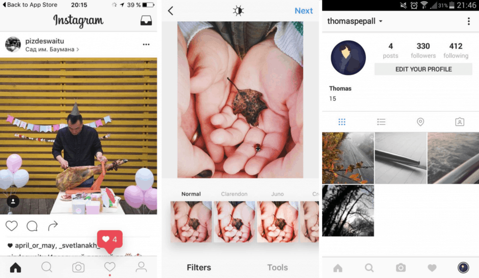
Instagram could be planning to overhaul its mobile apps with a new black and white interface that will make your photos pop.
The redesign has already rolled out to a small number of users as part of an early test, but Instagram won’t tell us if it will be keeping it.
Screenshots uploaded to Reddit show that the new look has already been spotted on both Android and iOS. It’s almost all black and white, but pink pops up occasionally to show there are new alerts in the activity feed.
By taking away bright colors from around your photos, Instagram hopes they’ll look even better. It makes the content, not the stuff around it, the main focus. But the Facebook-owned business won’t confirm whether the new interface will become a permanent fixture.
“We often test new experiences with a small percentage of the global community,” an Instagram spokesperson told Mashable. “This is a design test only.”
The fact that Instagram is already making the interface available to some suggests it’s more than just an idea right now. But if users hate it — and it seems many on social media do — then it could well be scrapped.
Personally, I think the app looks better in black and white. I’m not sure it makes photos look any better — but it does look cleaner and simpler.
- SourceReddit
- ViaMashable
- ImageThomas Pepall


