Twitter rolls out a massive redesign on mobile

Twitter has begun rolling out the latest version of its mobile apps today, introducing a big redesign that unifies the user experience across Android and iOS.
It’s prettier and easier to navigate, but it still doesn’t deliver the option to edit tweets.
Twitter has been toying with design changes on Android for the past year or so. Now those changes — and many more — are migrating to iOS, Tweetdeck, and the Twitter Lite app aimed at emerging markets where data connectivity is spotty.
The first thing you’ll notice is better typography, new icons, and round avatars. Twitter has also changed the reply button to a speech bubble because many users thought the old, arrow-shaped icon “meant delete or go back to a previous page.”
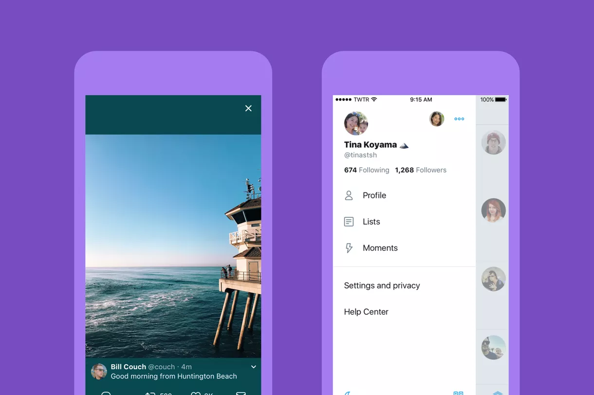
Swiping from the left of the screen reveals your profile panel, where you can quickly see your latest counts for following and followers. It also contains the buttons for your lists, Moments, your full profile page, and the settings and privacy menu.

Twitter has finally swapped its own in-app browser for Apple’s Safari View Controller, which means you now get features like content blocking, AutoFill, and the Reader view. It makes clicking links to webpages and articles a significantly less painful experience.
Twitter on mobile looked perfectly decent prior to this redesign, but the company will undoubtedly be hoping that a new look can attract new users and boost interest in its network. Many of the changes can also be enjoyed in your browser on a desktop.
The latest version of the Twitter app is rolling out over the coming days. You’ll be able to download it from the App Store and Google Play.


