The BlackBerry Z10: A Promising Start, But Don’t Switch Yet [Review]
BlackBerry 10
 As this review is aimed at Cult of Mac and Cult of Android readers, the Z10’s operating system is likely to be the biggest area of interest here. This is the first device to run the new BlackBerry 10 OS, and in comparison with previous BlackBerry platforms, it’s a giant leap forward.
And let’s not underestimate how important this is for BlackBerry — BB10 is the Canadian company’s last shot at clawing back some of the market share it has lost to rivals over the past few years. If the platform fails, it’s hard to see how BlackBerry will continue.
Like the BlackBerry PlayBook OS, BB10 is built upon QNX, and tailored for touch-based devices. This isn’t a rehash of previous BB platforms; it’s a brand new OS that supposedly doesn’t contain a single line of code from its predecessors.
Gestures
Because the Z10 doesn’t have a home button, navigation requires a number of simple gestures. BlackBerry tells you about these in a little leaflet that comes with the device, and once you’ve gotten used to them — which takes all of about 30 seconds — they’re actually a nice way of getting around.
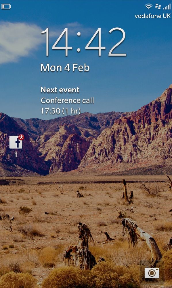
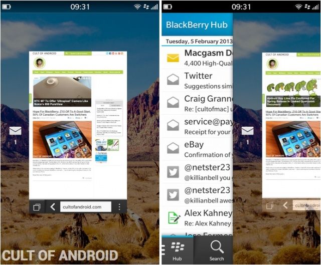
A swipe up from the bottom of the screen wakes the device from sleep and unlocks it, and closes any app you have open. If you swipe up and then towards the right, you’ll be taken to the BlackBerry Hub. What’s nice about this is you can actually “peek” at your Hub and see your notifications without actually going into it — you just perform the same gesture but hold your finger on the display. You can then swipe back down to return to what you were doing.
You can also swipe down in some apps to see additional options, or swipe down from the home screen to see the quick settings toolbar, where you can toggle silent mode, Bluetooth, Wi-Fi, rotation lock, and more.
Unfortunately, it’s never clear where these slide-down menus are available, and it can get a little confusing. For example, I didn’t know the Calculator app had a unit converter and a tip calculator until I performed a downward slide after using it for several days. It’s easy to see how users might miss key features in certain apps if it isn’t clear that they’re hidden away in a drawer at the top.
Again, the gestures themselves are easy to learn, and once you’ve got them they’re like second nature; I actually kept trying to close Android apps on my Nexus 4 with an upward swipe after using the Z10 for a few days. But developers will need to make it clear if they’ve hidden things in different places.
Home Screen & Active Frames
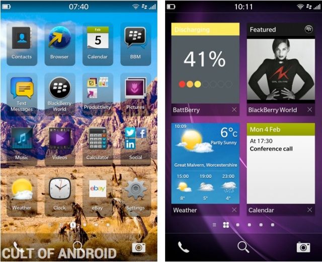
BB10’s home screen has much in common with that of iOS; it’s a relatively simple grid of static icons, which you can tap and hold to move around or place in folders. There’s a status bar at the top that includes the time in the center, your battery indicator — without a percentage — on the left, and your cell and Wi-Fi signals on the right. Other indicators will pop up in this bar from time to time, such as those for NFC, Bluetooth, silent mode, and if you have an alarm set.
At the bottom of the home screen there’s a dock of sorts, but you can’t customize it. There’s a shortcut to the phone app on the left, a shortcut to the camera app on the right, and a shortcut to search — which is just like iOS’s Spotlight feature — in the middle.
The Active Frames screen, which sits to the left of the home screen, is one of BB10’s unique features. When you close an app, it automatically goes to the Active Frames screen. This holds 8 apps at a time, and they automatically close as you open more apps. If you want to close them manually, you can do so by hitting the little cross beneath their preview windows.
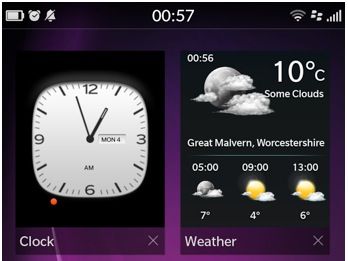
Active Frames are great for multitasking, because they allow you to quickly switch between your most recent apps — and in some cases see exactly what you were doing within certain apps when you closed them. But what’s really great is that some of those Active Frames turn into live widgets.
For example, when you have the Calendar app in an Active Frame, you’ll see any upcoming appointments you have. The Weather app will provide you with a brief forecast, Music tells you what’s playing, and even the Phone app will display a little list of your three most recent calls.
I’ve found these widgets to be a really nice touch, but this is an area that needs a little improvement. First, there’s no way of knowing which apps become widgets when open in the Active Frames area, and which just show a preview of what they’re doing. Furthermore, there’s no way to pin or rearrange the Active Frames you have open. That means you can’t keep the Weather widget pinned to the top of the page if you want to — when you start opening other apps, it’ll disappear further down the page until it’s eventually closed automatically.
I’d like to see BlackBerry change this in a future update, because the ability to pin those widgets to the page is a simple thing that would make Active Frames so much more useful. Right now, it’s just a pretty way of multitasking, but it could quite easily become more.
Next Page: BlackBerry 10: BlackBerry Hub & Keyboard


