I love the Google Glass interface and I think it should be everywhere.
This interface is similar to a blog in that the basic organizing principle is time. When you tap the side of the Glass headset or tilt your head up, you’re greeted with the “right now” screen, which literally shows the time right now.
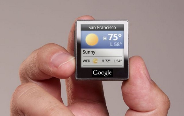
Scrolling to the left takes you into the future (today’s weather, directions to places Google Now thinks you might want to go, today’s birthdays, today’s weather highs and lows, your calendar and at the very end, Settings for Glass).
Scrolling to the right takes you into the past. The first item you encounter is the last thing you did — the last picture or video you took, the last message that came in, that sort of thing. The second card is the next-to-the-last thing that happened, and so on into the past.
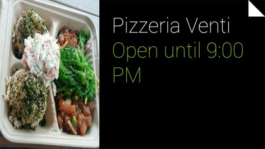
Each of these items, of course, is a “card,” which has its own behavior when you tap and drill down. For example, if you’re looking at a photo you took, taping the touchpad offers up the options to Share or Delete. If you choose share, you’re given people and Google+ circles, again in reverse chronological order from the most recently used.
The interface is wonderful because it’s highly compatible with human psychology. We tend to organize discreet events in our lives in terms of time, both future and past. The human mind loves linearity based on time. That’s why blogs and social networks are popular.
This, combined with voice, through which we can conjure up anything out of time sequence and thereby insert it into the timeline, is a truly great user interface, and should be on many devices.

